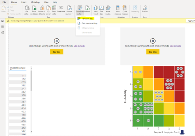
Our Risk Heatmap / Matrix requires 1 to 10 as values, but what to do if your data is continuous and not in this interval? Or if the expressions of your risks consist of words? Below are four solutions with binning, quintiles, custom thresholds and words to numbers mapping.
Binning
In this solution approach, all continuous values in your data set are divided into five bins. Please note that the size of the bin is always the same.
Example: Your values are between 0 and 100: The following bins are created:
- 0 to 20
- 21 to 40
- 41 to 60
- 61 to 80
- 81 to 100
This therefore does not take into account the quantity of risks within the individual bins. The data ranges are only divided equally.
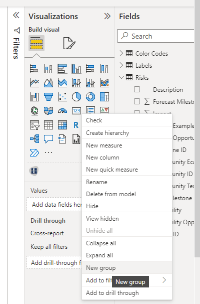
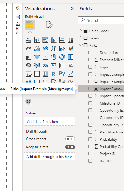
In the sidebar, first right-click on the field you want to transform. In our example the field “Impact Example”.
Then select “New group” with a left click. The “Groups” window opens.
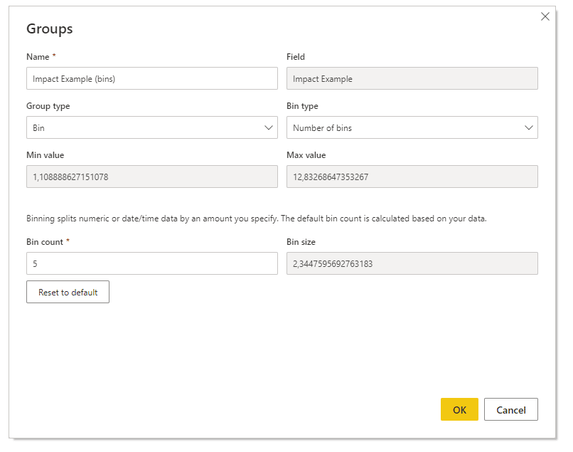
Here you select the option “Number of bins” for the “Bin type”. On the bottom left you enter the value “10” as “Bin Count”. It then calculates the width of the bins automatically under “Bin size”.
Finally click on “OK”.
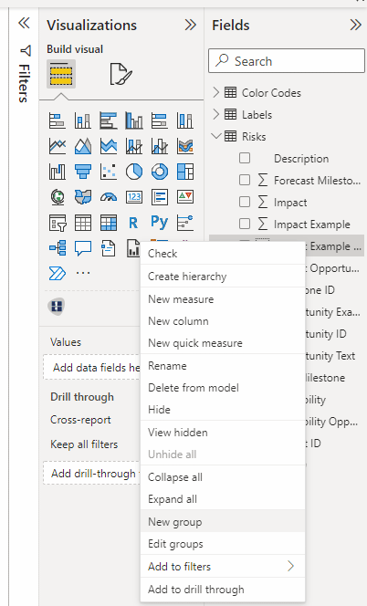
In the last step you click on the newly created field in the sidebar again.
Now the “Groups” window appears again.
Here you select the group type “List” instead of “Bin”. The ungrouped values appear in the left box.
You now start and select each value and move it to the right column via the “Group” button.
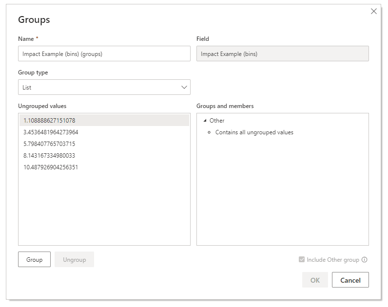
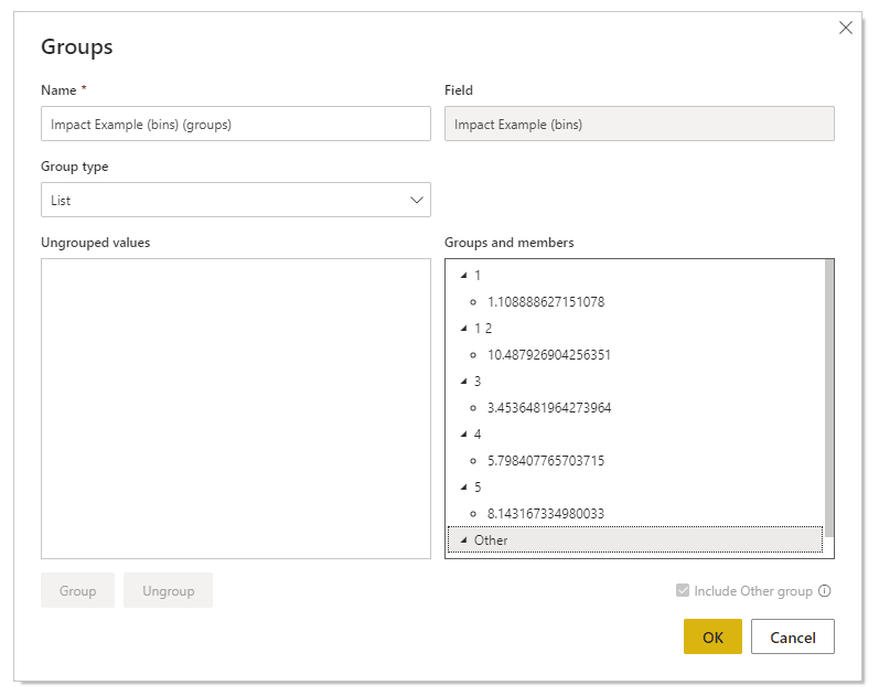
Almost ready! You now assign the values 1 to 10 to the ten values by double-clicking on each supergroup and inserting the values. Finally you click on “OK”.
Done! You have transformed the data and can now drag it onto an axis in our Risk Matrix.
Quintiles
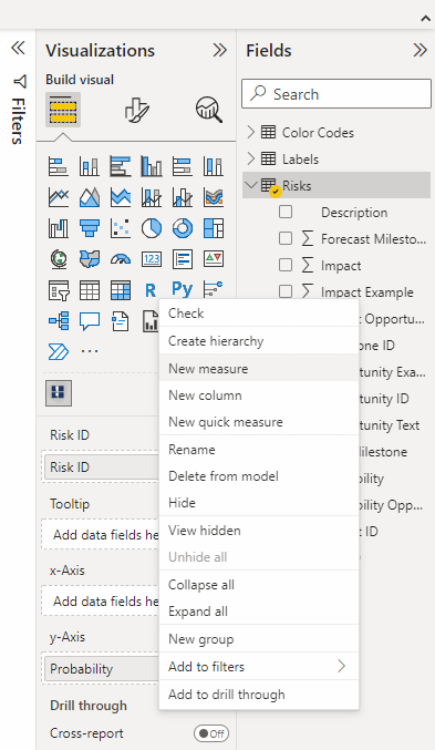
We first right-click again on the field we want to discretize. In our example it is “Impact Example”. We then select “New measure”. The DAX Editor opens above the dashboard.
We now add the following code, customized to the table and desired column in your dataset. Important – this is an example for quintiles. You can adapt this to percentiles if needed:
Quantile =
var FirstQuantile = CALCULATE(PERCENTILE.INC(Table[Column], .2), ALL(Table[Column]))
var SecondQuantile = CALCULATE(PERCENTILE.INC(Table[Column], .4), ALL(Table[Column]))
var ThirdQuantile = CALCULATE(PERCENTILE.INC(Table[Column], .6), ALL(Table[Column]))
var FourthQuantile = CALCULATE(PERCENTILE.INC(Table[Column], .8), ALL(Table[Column]))
var ThisVal = Min(Table[Column])
return
IF(HASONEVALUE(Table[Column]),
IF(ThisVal <= FirstQuantile, 1,
IF(ThisVal > FirstQuantile && ThisVal <= SecondQuantile, 2,
IF(ThisVal > SecondQuantile && ThisVal <= ThirdQuantile, 3,
IF(ThisVal > ThirdQuantile && ThisVal <= FourthQuantile, 4,
5)
)
)
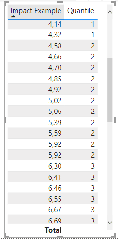
) )Ready! We have thus discretized and obtained the values 1 to 5. We can now use this field for our Risk Matrix!
Custom Thresholds
We first right-click again on the field we want to discretize. In our example it is “Impact Example”. We then select “New measure”. The DAX Editor opens above the dashboard.
We now add the following code, customized to the table and desired column in your dataset:
Custom_Thresholds =
var FirstThreshold = your_first_threshold_value_here
var SecondThreshold = your_second_threshold_value_here
var ThirdThreshold = your_third_threshold_value_here
var FourthThreshold = your_fourth_threshold_value_here
var ThisVal = Min(Table[Column])
return
IF(HASONEVALUE(Table[Column]),
		IF(ThisVal <= FirstThreshold, 1,
			IF(ThisVal > FirstThreshold && ThisVal <= SecondThreshold, 2,
				IF(ThisVal > SecondThreshold && ThisVal <= ThirdThreshold, 3,
					IF(ThisVal > ThirdThreshold && ThisVal <= FourthThreshold, 4,
				5)
			)
		)
) )
Words to Numbers
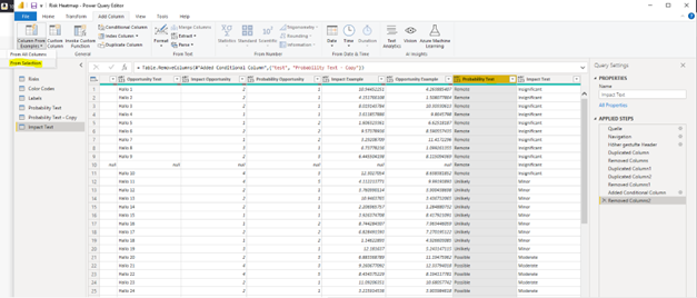
First you click on “Transform data” in the menu. This opens the Power Query Editor.
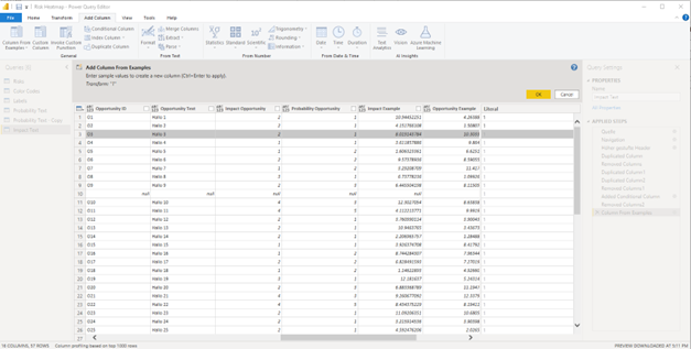
You select the column you want to transform. In this example it is the column “Probability Text”. Then click on “Column from Examples” in the upper left corner and select “From Selection”.

A new column is added. You click on the first cell of the new column and insert the desired numerical value. In our example, “Remote” (lowest expression) corresponds to the value “1”. You don’t have to change all the values individually. Power BI recognizes the numbers and automatically maps them according to two examples of yours.
You repeat this for every expression in your data set …
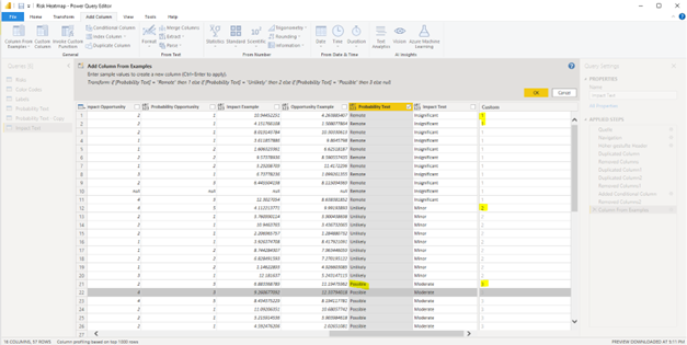
After you have mapped your last expression, you finally click on „OK“ . There you have it: A transformed column for “Probability”. You repeat this with “Impact” and you have the required data format. We chose this 1 to 10 logic, because everyone has a different wording for the five categories.