![]()
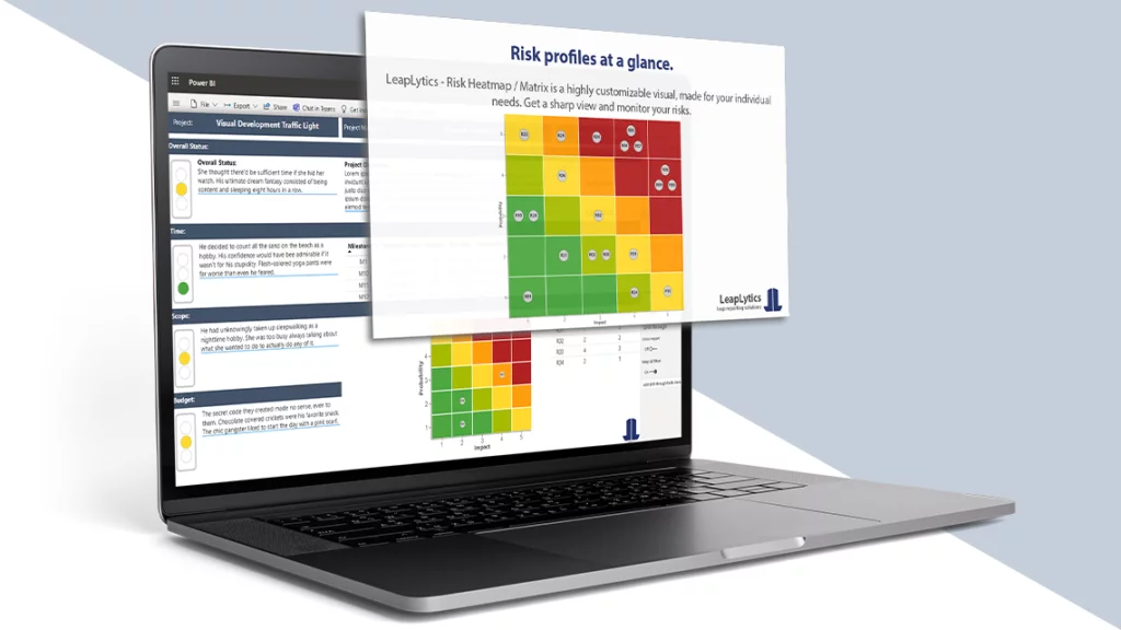
Why should you use our Risk Matrix?
It’s simple. We make you work easier. Our risk matrix shows your risk profiles in a straightforward way.
Trusted By
“An excellent tool to visualize and ensure a holistic overview of the risk portfolio. The possibility to customize colors, thresholds, and the risk matrix is ideal—easy to set up and provides an opportunity to use the solution for different levels of risks—enterprise, project, program, etc. The new feature of visualizing the change in individual risk positions on the heatmap is perfect for reporting, as the precise change in probability or impact is clearly understandable even for non-professionals in risk management, allowing them to follow the changes.” Rail Baltica
What’s in it for me?
We have so many features. You can select all sizes between a 3×3 and 10×10 matrix. You can change colors. You can classify risks by colorization. And you have a built-in mouse-over feature for every risk. Want to see more details and have a risk detail page? Use our drill-through function to dive deep into your risks. Want to see every risk in a plain overview? Lower the sum of risks in our settings to a minimum.
It works exactly as expected and advertised.
“Purchased a license for this app nearly 9 months ago, installed it in several reports being used by hundreds of people around the world and have had only positive feedback from users.” – Microsoft AppSource Review Rating:
How you can benefit
What do users like about your risk matrix? Before they struggled. With prioritization of their risks. Or with their communication with management and colleagues. They even had more conflicts in the past. These aspects were starting points for users to use our LeapLytics Risk Matrix.
Absolutely worth it
“Everything we wanted to achieve with a risk matrix, we were able to implement with this visualization. Absolutely worth it.” – Microsoft AppSource Review Rating:
Peak performance
We can’t solve everything. But if you are looking for a risk matrix in Power BI, it won’t get any better than this. And we receive feedback that not only soft factors have improved. Users report that they were able to better prevent or contain financial, personal and property damage.
Features

Grid Settings
Change the matrix size and grid layout to your specific needs.

Axis Settings
Define the axis labels and change the appearance on your own.

Color Settings
Change the color of all graphical items to meet your CI-standards.
Text Settings
Make use of the text settings, to fit the text appearance to your individual needs.

Indicator Settings
Define the look of the risk indicators to meet your taste and CI-standards.

PBI Certified
This visual meets the highest Microsoft security standards and supports export to PDF and PowerPoint.
Your boss will love you
Why? Did you ever receive feedback that something in the report was slow, not intuitive, needs more clicks or is too complex? That is what you won’t hear from using our LeapLytics Risk Matrix. We have built the visual that we, as risk and project managers, always wanted. And that is what we want to share with you.
Very helpful risk management tool
“I find the Risk Heatmap very helpful in our risk management process. It helps visualize the risk in an easy and understandable way for both the board and also the rest of the company. It’s also easy to use and you quickly get a hang of how the settings works.” – Microsoft AppSource Review Rating:
Risk manager *really* like our Risk Matrix
We finally fixed your risk matrix issue in Power BI. And we hope this visual helps you create better dashboards. To make everything else much easier. Keep reading the nice things people say about our risk matrix (MS AppSource Reviews).
Try It Now!
We fixed it. Once for all.
When you put it all together, purposefully built settings for the different flavors of risk tracking, dedicated features, strong privacy protections, and an innovative, integrated historization. It’s like magic.
Letter from CEO
Hey everyone—
I’m Stefan, CEO here at LeapLytics.
Risk matrices get a bad rap, but they shouldn’t. They’re a treasure.
It feels great to have a risk matrix that helps you understand potential threats and opportunities. That’s how risk matrices used to feel all the time.
But things changed.
You started seeing risks you didn’t anticipate from sources you didn’t expect. You lost control over understanding your risk landscape. An avalanche of data cluttered everything up.
And traditional risk management tools just let it happen.
Now risk matrices feel like a burden, rather than a tool for insight. Something you fall behind on. Something you clear out, not cherish. Rather than delight in it, you deal with it.
And yet, risk matrices remain a wonder. Thanks to them, organizations across industries, sectors, departments, and teams assess and mitigate risks every day. They’re reliable. They’re informative. They make it easy for teams to align their strategies and for organizations to thrive.
So good news, the magic’s still there. It’s just obscured — buried under a mess of outdated practices and neglect. Some from people, some from processes, a lot from outdated risk management tools.
Risk matrices deserve a dust off. A renovation. Modernized for the way we manage risks today.
With our Risk Matrix solution, we’ve done just that. It’s a redo, a rethink, a simplified, potent reintroduction of risk management. A fresh start, the way it should be.
Our Risk Matrix solution is our love letter to risk management, and we’re rolling it out to you on Power BI, ensuring accessibility and usability across platforms and devices.
Best regards,
Stefan Preusler
Co-Founder and CEO, LeapLytics GmbH

Getting Started
How can I start? Request a trial license above. And when you received a license code? Just click below to start our tutorial.