Stefan Preusler, CEO LeapLytics
Here is a statement I stand behind completely: the majority of Power BI risk dashboards in production today do not change a single decision. They are opened before a meeting, shown on a screen, and closed again. The decisions were already made — in a separate conversation, in a hallway, in an email thread. The Power BI risk dashboard was the wallpaper.
Three Things I See in Practice That Nobody Wants to Say Out Loud
First: Most risk dashboards are built for the builder, not the decision-maker. I have sat in enough customer calls to recognize the pattern. A BI analyst spends three weeks building something genuinely impressive — color gradients, animated KPIs, a scatter chart that approximates a risk matrix if you squint at it. It looks polished. The problem is that the people who need to act on the data — the program director, the CFO, the audit committee chair — cannot read it without a guided tour. Complexity designed to demonstrate analytical capability is the opposite of a useful governance tool.
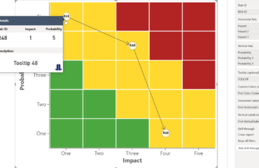
Second: The absence of interactivity kills the follow-up question. The most important moment in a risk review is not when someone says “I see the overall risk score is amber.” It is when they ask “which specific risks drove that?” and “have they gotten worse since last month?” A static dashboard — even a beautiful one — cannot answer those questions in the room. The analyst promises to follow up. The follow-up becomes another slide deck. The cycle repeats. Real data visualization decision-making requires that the tool can be interrogated live, by the person asking the question, without a technical intermediary.
Third: The update cadence is broken. I regularly encounter risk dashboards that are refreshed monthly, or manually, or “when someone remembers.” A risk that escalated on Tuesday is not visible until the third Thursday of the following month. At that point, the dashboard is not a risk management tool — it is a historical record. There is a meaningful difference between those two things, and most organizations have quietly accepted the wrong one.
The Counterargument — and Why It Doesn’t Hold
The pushback I hear most often is this: “Our stakeholders don’t want to interact with dashboards. They want a summary.” I understand why people believe this. Senior leaders are busy. They have said — probably more than once — that they want a simple one-pager, not a tool they have to learn.
But watch what happens when you put a well-designed, genuinely interactive risk matrix in front of a program director for the first time — one where they can click a quadrant and instantly see which risks sit there, filter by workstream, and slide a time axis to see how the picture has changed. They don’t disengage. They lean in. The “I just want a summary” preference is largely a conditioned response to years of being handed tools that were too complex or too static to be worth engaging with. It is not an innate preference for less information.
Gartner’s research on data and analytics adoption consistently shows that the gap between dashboard availability and dashboard-driven decision-making is not a technology problem — it is a design and usability problem. The tool exists. The data exists. The breakdown is in how the two are connected to the people who need to act.
What Should Actually Change
Stop evaluating risk dashboards by how they look in a screenshot. Start evaluating them by what question they can answer in under 30 seconds — without analyst support, in a live meeting, by the person who has to make a call.
Concretely, that means three things:
- Design for the least technical stakeholder in the room, not the most capable analyst on your team. If the audit committee chair cannot navigate it alone, it has failed its primary purpose — regardless of how sophisticated the underlying data model is.
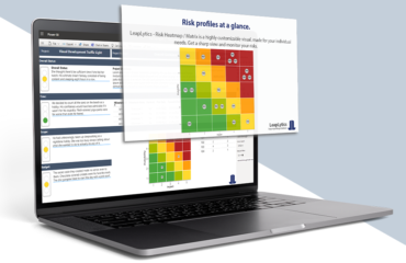
- Build interactivity in from the start. Drill-down from risk quadrant to individual risk detail, time-based trend filtering, and workstream-level status views are not advanced features — they are the baseline for a risk management dashboard that earns its place in a governance process. Tools like the LeapLytics Risk Matrix for Power BI exist precisely because native visuals do not provide this out of the box.
- Treat a monthly refresh cycle as a defect, not a feature. If your risk data changes faster than your dashboard updates — and it does — you are reporting history, not managing risk. Automated refresh connected to live data sources is not a luxury; it is the minimum viable standard for a tool that claims to support real-time governance.
The Question I’d Like to Hear Answered
When was the last time a risk dashboard — not a conversation, not a report, not a follow-up email, but the dashboard itself — directly changed a decision in your organization?
If you have to think for more than a few seconds, I’d argue that is the most honest data point about your current setup you have.
Stefan Preusler is the co-founder and CEO of LeapLytics, a software company specializing in Power BI custom visuals for risk management and project governance. He has been building data visualization tools for regulated industries since 2020.