Use Case: PMO Risk Reporting · Industry: Automotive · Tools: LeapLytics Risk Matrix + Traffic Light for Power BI
The Problem: Every PMO Leader in Automotive Knows This Meeting
It is Thursday afternoon. The steering committee meets in 90 minutes. Somewhere on your desktop are three different versions of a risk register — one from platform engineering, one from supplier integration, one from the program office — each formatted differently, each with its own color conventions, and none of them current. You spend 45 minutes consolidating them into a slide deck that will be outdated before it is presented. The committee asks which risks have escalated since last month. You estimate. They ask which project workstreams are currently amber versus red. You flip back through slides. Nobody in the room has a clear picture of the overall risk posture. The meeting ends with action items to “align on risk definitions” — again. This is not a data problem. It is a visualization and workflow problem, and it costs automotive PMO teams more time and credibility than most organizations formally track.
Why Standard Tools Fall Short for PMO Risk Reporting
Most automotive PMO teams reach for either Excel or Power BI’s native visuals when building risk reports. Both are reasonable starting points — and both run into the same structural limitations once risk communication needs to scale beyond a single project or a single analyst.
1. No Risk Trend History
Standard Power BI visuals and Excel-based risk registers show you where risks are now. They do not show you where they were last month, how fast they are moving, or which risks have been escalating consistently over multiple reporting cycles. For a PMO leader presenting to a steering committee, the question “has this risk gotten worse?” is often more important than “what is the current score?” — and native tools cannot answer it without significant manual workaround. A risk that was medium three months ago and is now high is fundamentally different from one that has been high all along. Without trend visibility, those two risks look identical in a standard report.
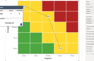
2. No Quadrant View — and No Drill-Down Into It
The most critical insight in risk management is the relationship between a risk’s likelihood and its potential impact. Native Power BI visuals — scatter charts, bar charts, tables — cannot represent this as a proper risk matrix quadrant. You can approximate it, but the visual language is wrong: a scatter chart is not a risk heat map, and stakeholders without analytical training will not read it correctly. More importantly, even if you build an approximation, you cannot click on a quadrant and drill down into the individual risks that sit within it. There is no interactivity between the risk overview and the underlying risk detail — which means every follow-up question still requires a manual filter or a new slide.
3. No Consistent Status Layer Across Projects
Automotive programs typically involve dozens of parallel workstreams — platform development, supplier qualification, homologation, software integration, production ramp-up. Each workstream generates its own risk and status data. Native Power BI offers no purpose-built visual for displaying RAG (Red-Amber-Green) status in a way that scales across multiple projects simultaneously and remains readable at a glance. Without a structured traffic light visualization, PMO teams resort to conditional formatting hacks or color-coded tables that break with any data model change and require manual maintenance each reporting cycle.
The LeapLytics Approach: Step-by-Step
Here is how automotive PMO teams typically implement a structured PMO risk management Power BI setup using the LeapLytics Risk Matrix and Traffic Light visuals — from data connection to steering committee presentation.
- Connect your risk register to Power BI. The starting point is your existing risk data — whether it lives in Excel, SharePoint Lists, an internal project management system, or a SQL database. Power BI’s standard connectors handle all of these without migration. The data model needs three columns at minimum: a risk description, a likelihood score, and an impact score. Most automotive PMO teams have this already; the question is whether it is structured consistently across workstreams, which the setup process helps enforce.
- Add the LeapLytics Risk Matrix visual to your report. The LeapLytics Risk Matrix is a certified custom visual available directly from Microsoft AppSource. Once added to your Power BI report, you map your likelihood and impact fields to the visual’s axes. The matrix automatically plots each risk as a positioned marker within the correct quadrant — high impact / high likelihood risks appear in the upper-right critical zone, low-priority risks in the lower-left. No manual positioning, no static images that go stale.
- Enable drill-down from quadrant to individual risk. Once the Risk Matrix is connected to your data model, clicking on any quadrant filters the rest of the report page to show only the risks within that zone. This means a steering committee member can click on the critical quadrant and immediately see a table of the specific risks that sit there — owner, mitigation status, last update — without the PMO leader switching slides or applying manual filters. The interaction is native to Power BI’s filter model and requires no additional configuration.
- Add trend tracking with time-based slicers. By structuring your risk register to include a date column — even a simple monthly snapshot — the Risk Matrix can be filtered by reporting period. This gives you the risk trend view that native visuals cannot provide: you can show the committee how the quadrant distribution looked in January versus March, which risks have moved from amber to red, and which previously critical risks have been successfully mitigated. For automotive programs with multi-year development cycles, this longitudinal view is often the most valuable governance output a PMO can produce.
- Layer in the Traffic Light visual for workstream-level status. Alongside the Risk Matrix, the LeapLytics Traffic Light visual provides a program-level overview of all active workstreams — platform, supplier, software, homologation — each displaying a RAG status derived directly from your data model. Unlike conditional formatting hacks, the Traffic Light visual updates automatically when underlying data changes and maintains consistent visual logic regardless of how many projects are in scope. It is designed to be readable on a large screen in a steering committee room, not just on an analyst’s laptop.
- Publish to Power BI Service and set data refresh. Once the report is built, it is published to Power BI Service and scheduled for automatic data refresh — daily, or on-demand if your risk register updates continuously. Stakeholders access it via browser or the Power BI mobile app. There is no email attachment, no version control issue, and no “latest version” ambiguity. The report the committee opens on Thursday afternoon is the same report the PMO leader reviewed that morning.
What Changes in the PMO Leader’s Day-to-Day
The shift from static risk slides to a live project risk dashboard does not just save preparation time — it changes the nature of risk conversations at the leadership level.
Steering committee meetings become shorter and more focused. When risk status is visible to all participants before the meeting starts, the session shifts from “here is what the risk picture looks like” to “here is what we need to decide about it.” PMO teams report that risk-related agenda items that previously required 30–40 minutes of slide-walking can be covered in 10–15 minutes when all participants have already seen the live dashboard.
Risk escalation happens faster. When a risk moves from medium to high, the relevant stakeholders see it in the live dashboard immediately — not in the next monthly report. For automotive programs where a single supplier qualification delay can affect production timing, early visibility into escalating risks has measurable downstream value.
PMO credibility increases with consistent, auditable reporting. One of the persistent challenges for automotive PMO functions is demonstrating that risk reporting is rigorous and methodology-consistent across projects. A structured Power BI Risk Matrix, built on a shared data model with standardized likelihood and impact scoring, provides exactly that auditability — and makes it easy to demonstrate consistency to internal audit or external program reviewers.
According to PMI’s risk management practice standards, effective risk communication to stakeholders is one of the most consistently underdeveloped capabilities in project-based organizations. A live, interactive risk dashboard directly addresses this gap — not by changing what data is collected, but by making it accessible to the right people in the right format at the right time.
FAQ: Common Questions from Automotive PMO Leaders
Our risk register is in Excel and maintained by five different project managers. Can this still work?
Yes — but the setup process will include a short data alignment step. The Risk Matrix visual requires consistent likelihood and impact scoring across all inputs, which means agreeing on a common scale (e.g., 1–5 for both axes) before connecting the data. In practice, this conversation is overdue in most multi-project PMO environments regardless of tooling. The Power BI setup surfaces the inconsistency and creates a forcing function to resolve it. Once the shared model is in place, each project manager can update their own Excel file and the dashboard refreshes automatically.
We already have Power BI. Do we need IT involvement to add custom visuals?
In most organizations, adding a certified custom visual from Microsoft AppSource requires either Power BI Admin access or a one-time approval from your tenant administrator. LeapLytics visuals are Microsoft-certified, which means they pass the standard security review and can typically be approved quickly. Once approved at the tenant level, any report author in your organization can use them without further IT involvement.
How long does it realistically take to go from our current Excel risk register to a live Power BI Risk Matrix dashboard?
For a single-program PMO with a reasonably structured risk register, two to four days of focused setup work is a realistic estimate — including data model alignment, visual configuration, and initial stakeholder review. Multi-program setups with legacy data in inconsistent formats may take two to three weeks. The critical dependency is not the tooling but the data: how consistently your risk data is currently structured across workstreams will determine how much cleanup is required before the dashboard can go live.