Every Monday morning — or Friday afternoon, depending on how your week is structured — someone on your team opens a spreadsheet. They copy data from three different sources into it. They update formulas that break when a new row gets added. They recolor cells by hand, adjust the risk scoring columns, and eventually produce a document that looks approximately like last week’s document, with different numbers in it. By the time it reaches you, it is already four hours old and one data export behind. This is risk reporting that is too slow — and it is happening in industrial companies across every size and sector, week after week, because the process was never designed to scale.
Why This Keeps Happening: Three Root Causes
1. The data lives in the wrong place
In most industrial organizations, risk data is not centralized — it is distributed. Operational risks live in project management tools. Financial risks live in ERP exports. Compliance risks live in audit management systems or, more commonly, in someone’s email inbox. Every week, a risk analyst or controller manually pulls these sources together into a master spreadsheet. The four hours are not spent thinking about risk. They are spent moving data between containers. This is not a skills problem or a motivation problem. It is an architecture problem: the reporting process was built around the assumption that data would always need to be manually assembled, and that assumption was never challenged.
2. The format requires constant manual maintenance
Excel risk registers are inherently fragile. Conditional formatting rules break when rows are inserted or deleted. Formulas that reference fixed cell ranges produce incorrect results when the dataset grows. Color-coding is manual — meaning someone has to remember to change a cell from yellow to red when a risk score crosses a threshold, and they have to do it every single week. Research across finance teams consistently shows that manual reporting workflows are responsible for a disproportionate share of reporting errors — not because analysts are careless, but because the format requires human intervention at every step where automation would be more reliable.
3. The output is designed for the person who built it, not the person who reads it
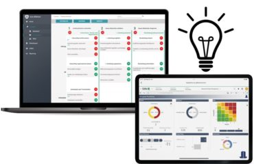
Most Excel-based risk reports are built by the analyst who owns the data, using the layout that made sense to them at the time. By the time the report reaches the CFO, CRO, or risk committee, it requires explanation. Columns need context. Color conventions are not self-evident. The heat map — if there is one — is a static image that was pasted in from a separate calculation. No one can click on a risk category to see the underlying items. The document answers the questions its author anticipated, not the ones the decision-maker actually has when they open it.
What Most Teams Try — And Why It Doesn’t Work
More sophisticated Excel formulas. Adding VLOOKUP chains, pivot tables, and dynamic named ranges makes the spreadsheet more powerful — and significantly more fragile. When the person who built it leaves, no one else can maintain it. The more complex the Excel solution, the more expensive the failure when it breaks.
More colors and conditional formatting. Risk reports with elaborate color schemes feel more rigorous. They are not. Color that requires a legend to interpret is not communication — it is decoration. And conditional formatting that has to be manually reviewed and corrected each week defeats its own purpose.
Moving the problem to PowerPoint. Many organizations “solve” the risk reporting bottleneck by having someone manually recreate the Excel data as a slide deck each week. This doubles the work and adds a second version-control problem. The slide deck is now a separate artifact that can diverge from the underlying data at any point — and usually does.
Buying a full GRC platform. Enterprise governance, risk, and compliance platforms are the right solution for organizations with mature, complex risk management programs. For industrial companies that primarily need clear, current, interactive risk visibility — not a full compliance management suite — they are often overengineered, expensive to implement, and slow to adopt. The problem is not lack of platform. It is lack of the right visualization layer on top of data that already exists.
What Actually Solves This: Three Principles
Connect, don’t copy. The four hours disappear when the reporting tool reads directly from the sources where risk data already lives — project systems, ERP exports, SharePoint lists — rather than requiring manual assembly. The analyst’s role shifts from data porter to data reviewer. This is the foundational change, and it does not require replacing existing systems.
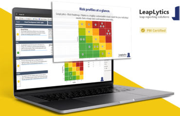
Automate the visual layer, not just the data layer. A connected dataset that still requires manual formatting each week has not solved the problem — it has just moved it. The visualization needs to update automatically when the data changes: risk positions plotted in the correct quadrant, color zones applied by rule not by hand, status indicators calculated from the data rather than entered by a human. This is exactly what a purpose-built automated risk reporting visual — like the LeapLytics Risk Matrix for Power BI — is designed to do: connect to live data and render the risk matrix without manual intervention.
Design for the decision-maker, not the analyst. The right output is not a document someone emails to a CFO. It is a live dashboard the CFO can open directly, filter by business unit or risk category, and drill into without asking for a follow-up. The metric that matters is not “hours to produce the report.” It is “seconds to answer a question the CFO has during a board preparation meeting.”
Before and After: A Concrete Example
An industrial manufacturing group with operations across four European countries ran a weekly risk reporting process that required a risk controller to spend approximately four hours every Friday consolidating data from site-level Excel registers, a central ERP export, and a compliance tracking sheet maintained by the legal team. The output was a formatted Excel file emailed to the CFO and three business unit heads. Questions asked during the Monday executive call typically required the controller to prepare a follow-up email with additional data.
After connecting the existing data sources to a Power BI report using the LeapLytics Risk Matrix visual: the Friday consolidation task was eliminated. The dashboard refreshed automatically from connected data sources. The CFO opened the report directly on Monday morning before the call. Questions about specific risk categories were answered in the meeting by clicking through to the underlying items — no follow-up email required. The controller’s four hours shifted to reviewing the dashboard for anomalies and preparing commentary on escalated risks — work that required judgment, not data movement. Time spent on risk report production: under 30 minutes per week.
The Next Step
If your team is spending four or more hours per week producing a risk report that still requires explanation when it lands in front of leadership, the problem is not the data — it is the process and the visualization layer on top of it. The fix does not require replacing your existing systems or a multi-month implementation project.
Start with a free trial of the LeapLytics Risk Matrix for Power BI. Connect it to your existing risk register — whether that is in Excel, SharePoint, or a database — and build a working risk dashboard in under an hour. See what your CFO or CRO sees when the data is live, interactive, and no longer requires a four-hour assembly process to make it presentable.
The four hours are not coming back on their own. But they do not have to stay lost.